ABOUT ME
Hi there! I'm Kamal, a B.Tech (CSE) student at NSHM College of Engineering & Technology, specializing in Data Analytics. I focus on Python, SQL, Excel, and Power BI, combined with strong knowledge of Statistics and Data Visualization, to turn raw data into actionable business insights.
II'm a passionate Data Analyst. My journey in tech began with a curiosity about uncovering patterns hidden in data, which led me to dive deep into SQL, BI tools, Python, Statistics, and Excel to transform raw data into actionable insights.

 Python
 Pandas
 NumPy
NumPy
 VS Code
A selection of my most recent and impactful work, showcasing my expertise in web development, design, and problem-solving.
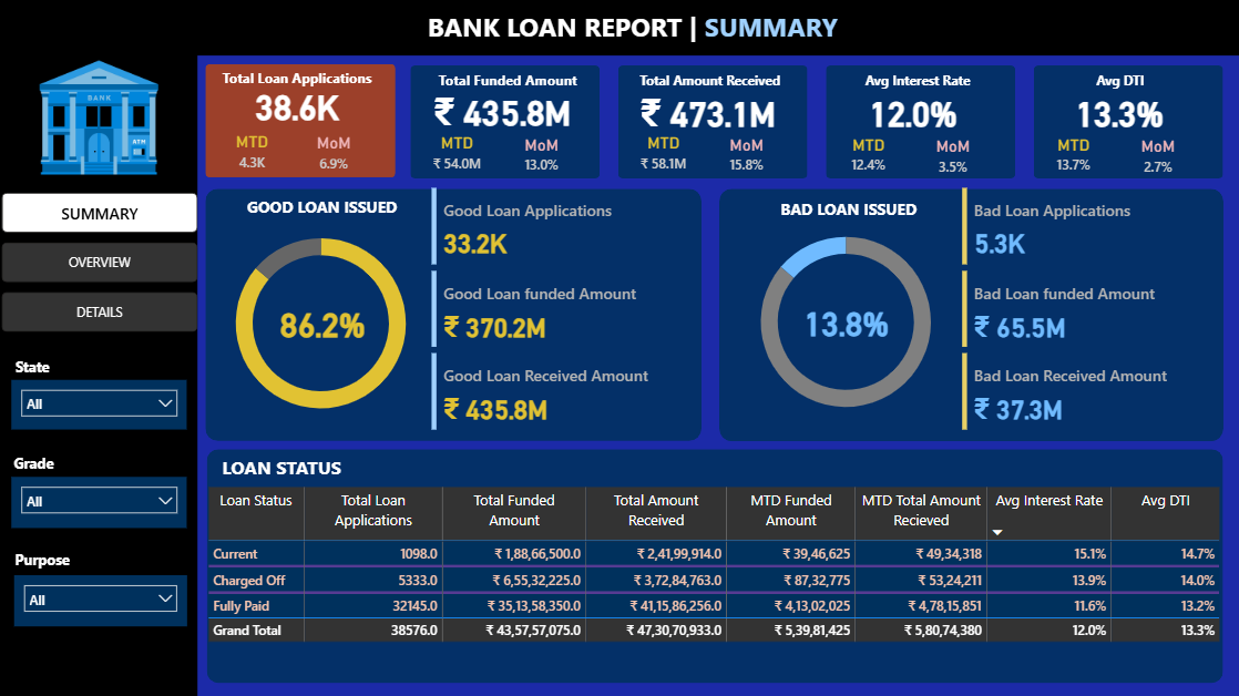
An interactive Bank Loan Report Dashboard built in Power BI using data
extracted with SQL queries.
The dashboard tracks overall loan portfolio performance through key lending KPIs,
MTD vs PMTD trends, Good vs Bad Loan split, and loan status analysis.
It consists of three sections:
Summary Dashboard (portfolio KPIs and loan quality),
Overview Dashboard (monthly trends, state, loan term, purpose, and borrower
profile),
and Details Dashboard (loan-level drilldown with filters).
The dashboard provides insights into portfolio health, borrower risk, and repayment
trends
to support data-driven credit strategies.
Key KPIs: Total Applications (38.6K),
Funded Amount (₹435.8M), Amount Received (₹473.1M),
Avg. Interest Rate (12.0%), Avg. DTI (13.3%).
Designed to help banks monitor performance, detect risks early, and improve lending
decisions.
SQL, Power BI, DAX, Power Query, Data Modeling, Data Visualization
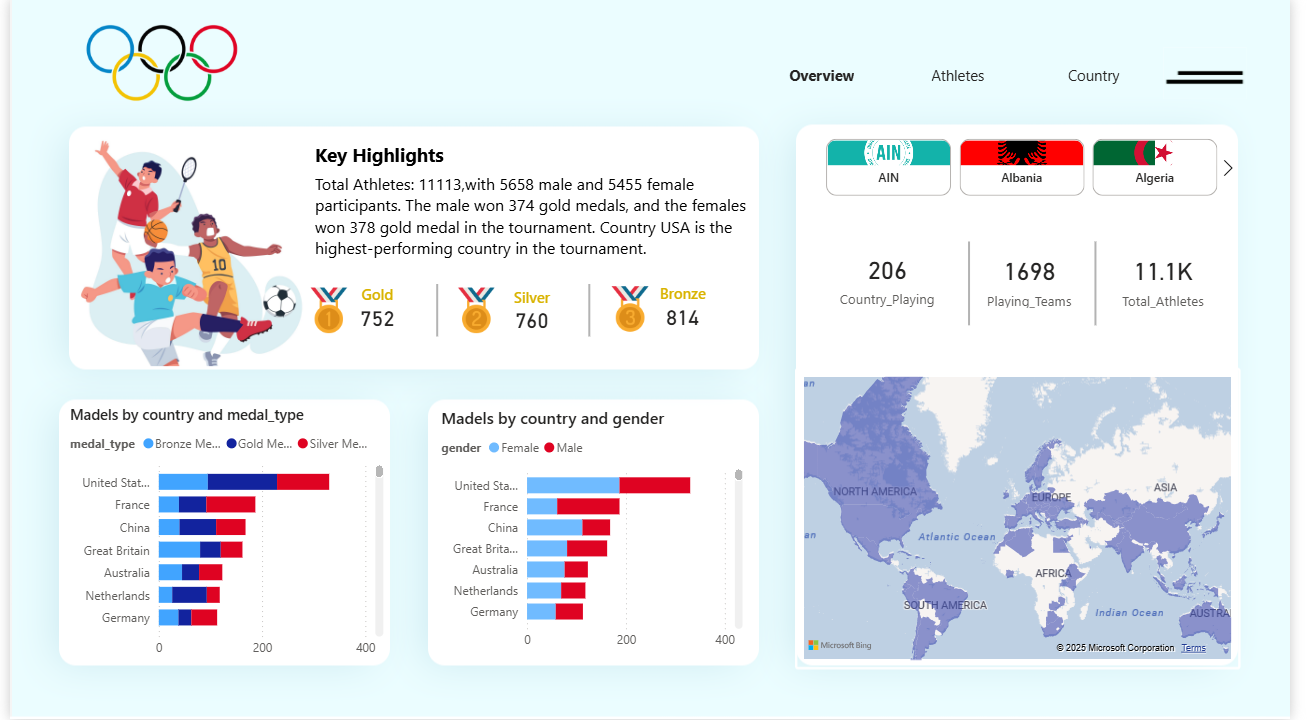
An interactive Olympic Games Performance Dashboard built in Power BI using
data
prepared and analyzed with Python and Excel.
The dashboard monitors overall athlete and country performance through key KPIs,
medal trends,
gender and age distribution, sport-wise participation, and top-performing countries &
athletes.
It consists of three main sections:
Country Performance (KPIs, year-wise trends, top 10 countries, medal comparison),
Athlete Analysis (Gender & age distribution, sports participation trends), and
Medal Insights (Medal type breakdown, top-performing athletes, country
contributions).
The dashboard provides deep insights.
to support data-driven decisions in sports analytics.
Key KPIs: Total Athletes, Total Medals, Total Gold
Medals, Gender Distribution, Age Distribution.
Python, Excel, Power BI, Data Visualization, Interactive Dashboards, KPI Reporting.
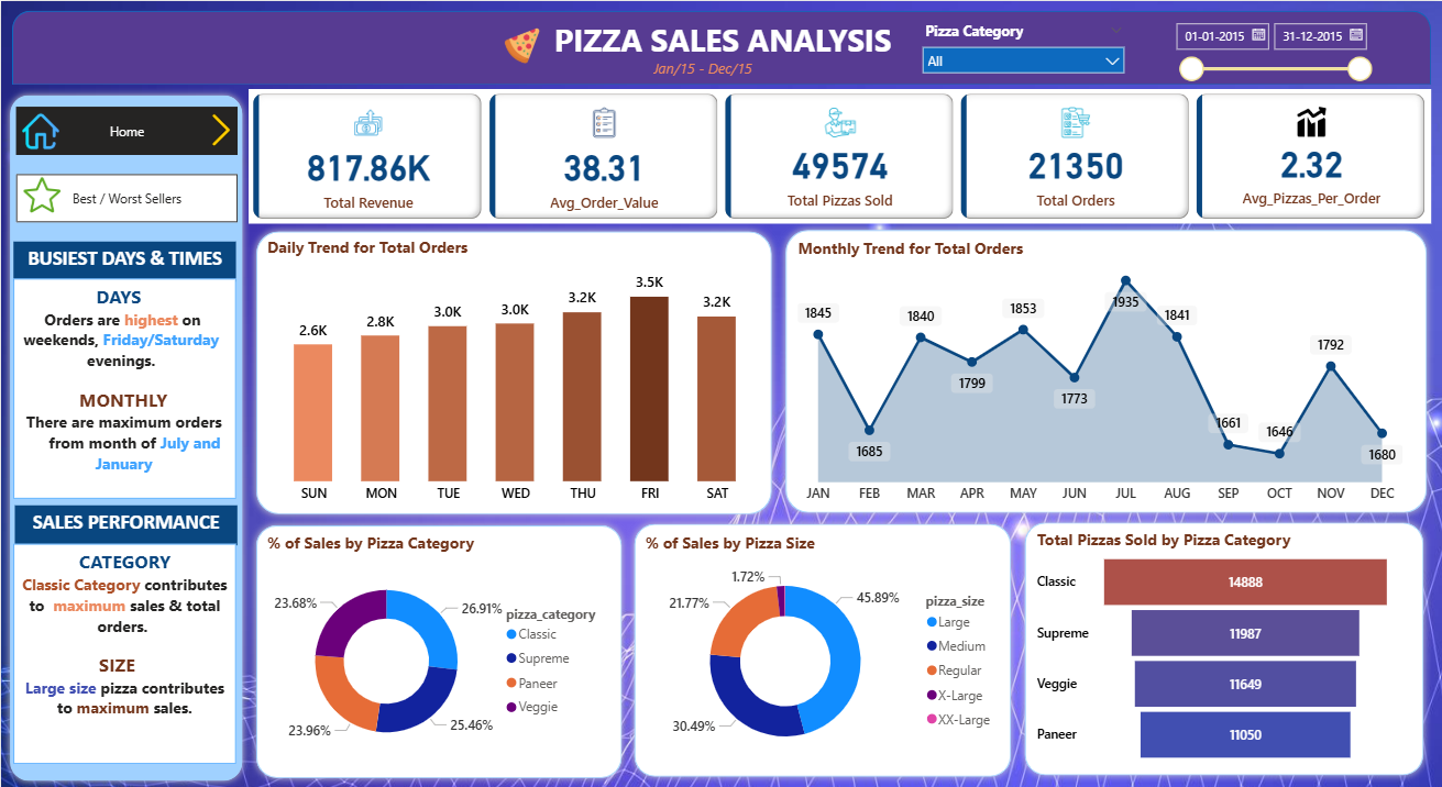
An interactive Pizza Sales Dashboard built in Power BI using data
extracted with SQL queries.
The dashboard monitors overall business performance through key sales KPIs, daily
& monthly order trends,
category and size-wise revenue, and top vs. bottom performing pizzas.
It consists of two main sections:
Home Tab (KPIs, trends, busiest days/months, sales distribution by category &
size) and
Best/Worst Sellers Tab (Top & Bottom 5 pizzas by Revenue, Quantity, and Orders).
The dashboard provides deep insights into customer demand patterns, product performance,
and
sales contribution by pizza type and size to support data-driven decision-making.
Key KPIs: Total Revenue (817.86K), Avg Order Value
(38.31),
Total Pizzas Sold (49,574), Total Orders (21,350), Avg Pizzas per Order (2.32)
SQL, Power BI, Data Modeling, Power Query, DAX, Data Visualization.
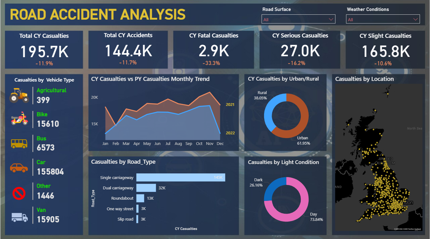
An interactive Road Accident Analysis Dashboard built in Power BI to provide a
detailed view of accident
patterns and casualty trends across the UK.
Data was cleaned and transformed in Power Query, while KPIs and calculated
measures were created using DAX
to deliver deeper insights into accident behavior over time.
The dashboard is designed to support transport authorities, policymakers, and safety
regulators in identifying
high-risk zones, improving road safety measures, & understanding how factors like
vehicle type, weather, &
road infrastructure contribute to accidents.
Key KPIs: Total Casualties, Fatal/Serious/Slight
Casualties,
Vehicle-Type Wise Casualties, Monthly Trends (CY vs PY), Urban-Rural Split, Road Type
Analysis,
Light Condition Impacts, and Accident Hotspot Mapping.
Power BI, Power Query, DAX, Data Modeling, Data Visualization
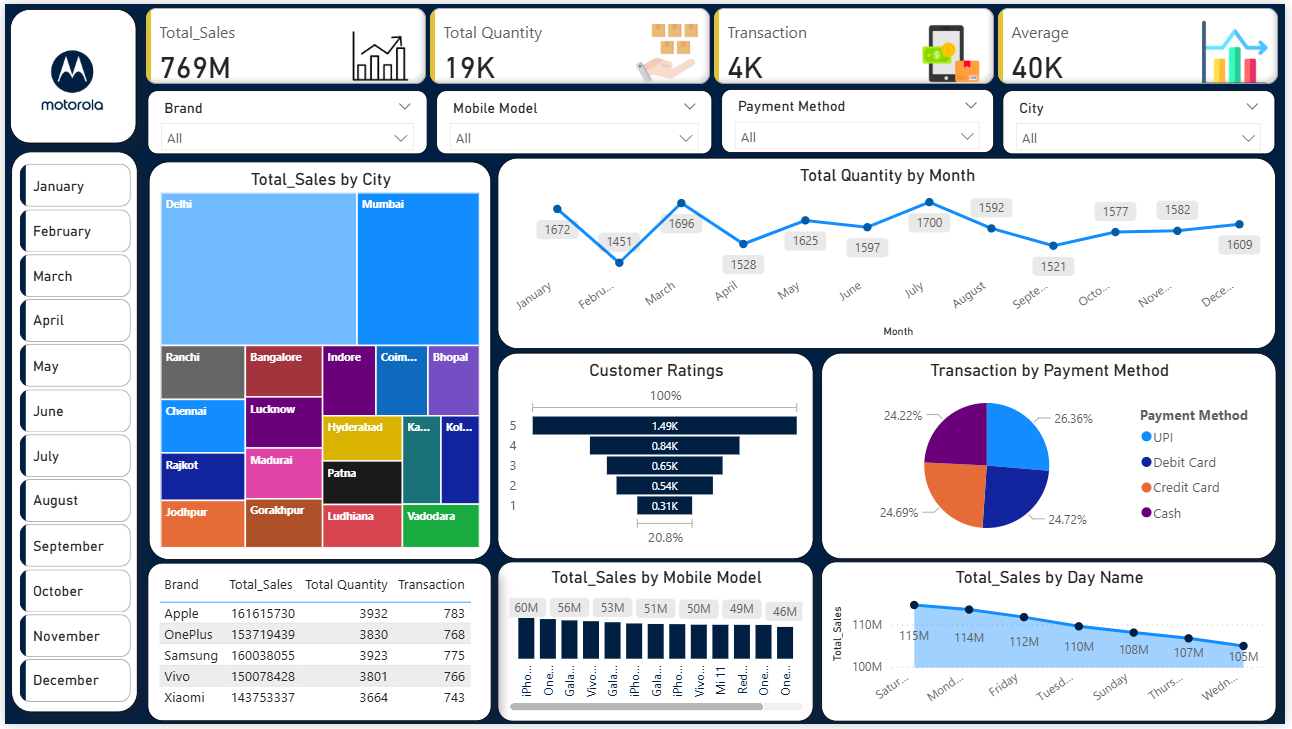
An interactive Mobile Sales Analytics Dashboard built in Power BI to analyze
sales performance, customer
behavior, and product trends across different brands, models, and cities.
Data cleaning and transformation were performed in Power Query, while calculated
measures and KPIs were built
using DAX to highlight key insights such as seasonal sales behavior, brand
comparisons, and customer sentiment.
The dashboard supports decision-making for sales strategy, promotional campaigns, and
inventory planning by
revealing both high-growth opportunities and weak areas in the business.
Key KPIs: Total Sales, Quantity Sold, Transactions,
Avg. Sales per Transaction,
Payment Method Share, Brand Ranking, Model Ranking, Customer Ratings, Seasonal Sales
Trends, Regional Performance
Power BI, Power Query, DAX, Data Modeling, Data Visualization
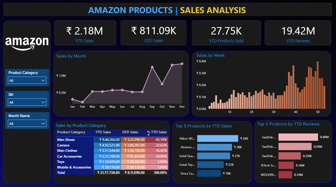
An interactive Amazon Products Sales Analysis Dashboard built in Power BI to
track product performance,
category contribution, and customer engagement at YTD and QTD levels.
Using Power Query for data preparation and DAX for KPIs, it highlights
sales growth, profitability,
and customer behavior.
Visuals such as slicers, drill-throughs, and ranking charts make it easy to explore
sales by product, category,
and timeline, helping managers identify high-growth opportunities and low-performing
areas.
Key KPIs: YTD Sales, QTD Sales, Products Sold,
Customer Reviews & Ratings,
Top Categories, Top Products, Monthly & Weekly Trends, Category Contribution
Power BI, Power Query, DAX, Data Modeling, Data Visualization
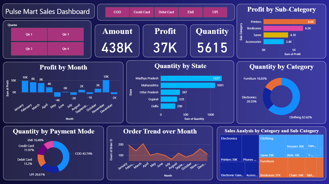
An interactive Market Pulse Analysis Dashboard built in Microsoft Power BI to
analyze sales, profit,
and customer behavior across products, categories, and regions.
Using data modeling, DAX, and advanced visuals, it tracks total revenue,
profit margins, sales quantity,
monthly profit trends, regional contributions, and payment preferences.
The dashboard helps managers identify sales patterns, optimize product strategy, and
make informed decisions
to improve profitability and market share.
Key KPIs: Total Sales (438K), Profit (37K),
Quantity Sold (5,615),
Profit by Category, Order Trends, Regional Sales Distribution, Payment Mode Contribution
Power BI, DAX, Data Modeling, Data Cleaning, Interactive Dashboards, Data Visualization
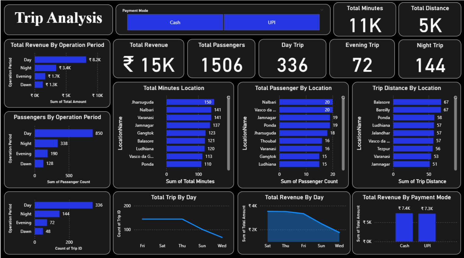
An interactive Trip Analysis Dashboard built in Power BI to analyze trip
performance, passenger behavior,
and operational efficiency across locations and time periods.
The dashboard tracks total revenue, passenger volume, trip minutes, distance covered,
and payment methods
to reveal travel patterns and service utilization.
Built using Power Query for data preparation and DAX for KPIs, it helps
managers identify peak demand,
optimize scheduling, allocate resources effectively, and improve customer satisfaction.
Key KPIs: Total Revenue, Total Passengers, Trip
Minutes, Distance Covered,
Payment Mode Share, Location Performance, Peak Demand Trends, Passenger Engagement
Power BI, Power Query, DAX, Data Modeling, Data Visualization, Interactive Dashboards
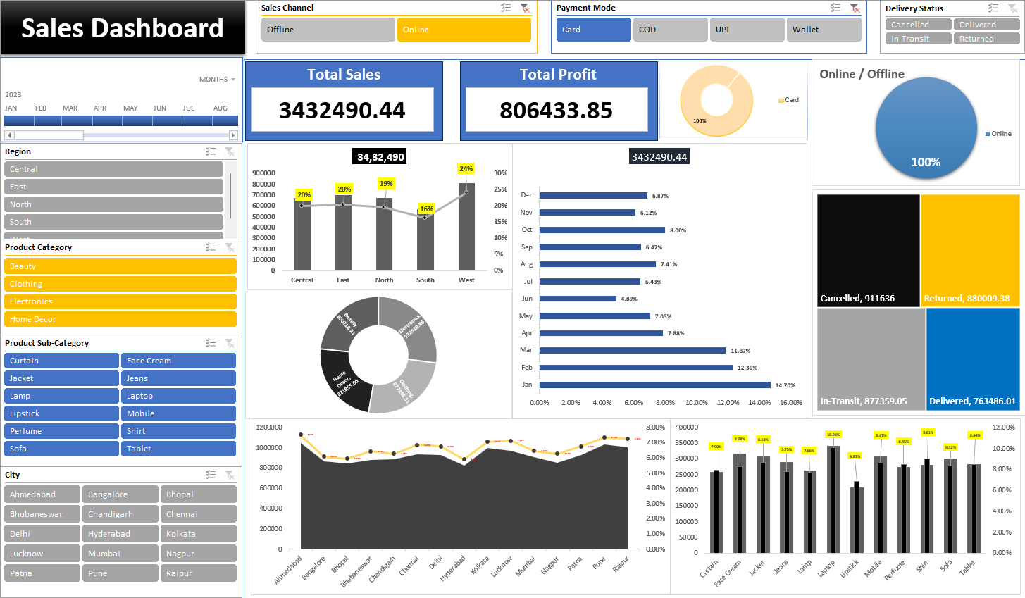
An interactive Sales Insights Dashboard built in Microsoft Excel using pivot
tables, slicers, and charts
to monitor business performance across regions, product categories, and cities. The
dashboard highlights total sales,
profit margins, monthly revenue trends, and delivery status while also analyzing online
vs. offline channels and
payment mode distribution. It provides a clear view of top-performing products and
regional contributions to support
data-driven decision-making.
Key KPIs: Total Sales (34.32M), Total Profit
(0.80M), Regional Sales %,
Payment Mode Share, Delivery Status
Microsoft Excel, Pivot Tables, Slicers, Charts, Data Cleaning
Final year
Grade: First Class Distinction
Have a project in mind or want to collaborate? Feel free to reach out using the form below or through my social media channels.
Your message has been sent successfully! I'll get back to you soon.